
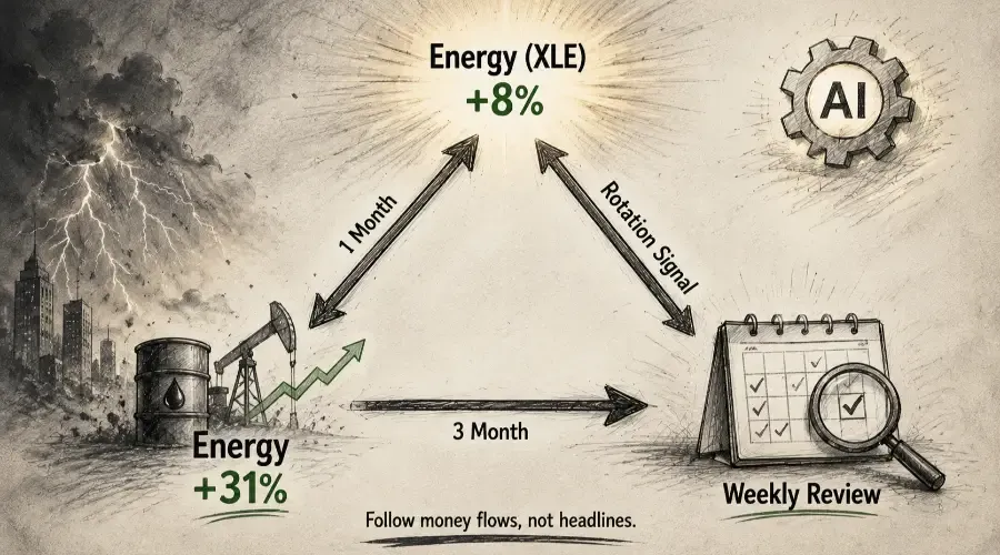
Money doesn't disappear from markets – it moves. When institutional capital rotates out of technology and into energy, the money changes address. Understanding where it's moving, and why, is the foundation of sector rotation strategy. The traders who navigate this well don't try to predict where money will flow next. They identify where it's already flowing, assess whether the macro environment supports that flow continuing, and position accordingly – before the rotation becomes obvious to everyone watching the index headline.
AI compresses the analytical work that rotation identification requires. Not by predicting the rotation, but by processing ETF performance data, cross-referencing it with macro inputs, and producing a structured assessment of the current cycle positioning. One important caveat before the framework: AI interprets the data you provide, and that interpretation is only as reliable as the data quality and prompt precision. If macro inputs are inaccurate or the ETF table contains inconsistent calculation methods, the model will produce a well-articulated but wrong analysis. Verify your data sources before trusting any output.
Sector rotation analysis is the first of six strategy-specific applications covered in the Strategy-Specific Applications with AI hub. It gives the full overview and covers why strategy-specific AI use outperforms generic market commentary.
The Business Cycle Investing Framework
Sector rotation follows patterns tied to the business cycle – expansion, peak, contraction, and trough. Different sectors lead and lag at different phases because their earnings are differently sensitive to economic conditions.
| Cycle Phase | Typical Sector Leaders | Typical Laggards |
|---|---|---|
| Early Expansion | Industrials, Financials, Consumer Discretionary, Technology | Utilities, Consumer Staples |
| Late Expansion | Energy, Materials, Industrials | Rate-sensitive sectors (Utilities, Real Estate) |
| Contraction | Healthcare, Consumer Staples, Utilities | Cyclicals, Technology |
| Recovery | Financials, Cyclicals | Defensive sectors |
This framework is not a mechanical system. Rotations don't follow the cycle on a fixed schedule. The framework provides the directional hypothesis. ETF performance data confirms or challenges it against what's actually happening.
One structural caveat worth noting: the SPDR Technology ETF (XLK) has evolved into a catch-all that includes massive, quasi-defensive cash-flow generators that behave differently from traditional cyclical growth stocks. Don't treat XLK as a pure cyclical growth signal – the composition matters and can mute what the rotation data is telling you about genuine growth sentiment.
What Data to Paste – The 11 SPDR Sector ETFs
The primary data input is the performance table for the 11 SPDR sector ETFs, which collectively cover the entire S&P 500 across every major sector. Source this from Finviz's ETF performance table – it copies directly into an AI prompt.
The 11 ETFs: XLK (Technology), XLF (Financials), XLE (Energy), XLV (Healthcare), XLI (Industrials), XLY (Consumer Discretionary), XLP (Consumer Staples), XLU (Utilities), XLRE (Real Estate), XLB (Materials), XLC (Communication Services).
For deeper analysis, consider equal-weight sector ETFs or sub-sector ETFs – for example, XBI for biotech within healthcare, or IGV for software within technology. The same prompt works with any ETF table and can surface rotations that the market-cap-weighted sector ETFs obscure.
Use the 1-month and 3-month performance columns alongside SPY as the baseline. The 1-month view captures recent momentum. The 3-month view provides medium-term trend context. Before pasting, ensure your table uses consistent calculation methods – all simple returns over calendar periods, not a mix of annualised and non-annualised figures. Inconsistent methods produce contradictions the model may misinterpret.
Sector outperformance above 3% versus SPY over a rolling four-week period is the threshold worth tracking as a genuine rotation signal, filtering out day-to-day relative performance noise. Rotation typically leads economic data by three to six months – making it a forward-looking signal about where conditions are heading, not just where they are.
Context matters for the threshold: in a strong bull market where SPY is up 15–20% over three months, sector outperformance above 3% is less meaningful – nearly all sectors participate in a rising tide. Rotation signals are most actionable in range-bound or moderately trending markets where genuine divergence between sectors reflects institutional preference rather than broad market momentum.
How to Prompt AI to Identify Rotation Signals
Act as a macro analyst conducting sector rotation analysis to identify
the current business cycle phase and sector leadership picture.

I've provided: (1) SPDR sector ETF performance table across 1-month,
3-month, and 6-month timeframes alongside SPY baseline, (2) current
macro context described below.

ETF performance table: [paste – confirm all returns use consistent
calculation methods before pasting]

Macro context: [Fed policy stance, latest ISM PMI readings, yield curve
configuration, credit spread levels, recent economic data releases]

Based only on the data I've provided:

(1) Identify the top three and bottom three sectors by combined 1-month
and 3-month momentum relative to SPY. Quantify outperformance or
underperformance versus SPY for each.

(2) Assess which business cycle phase the current sector leadership
pattern is most consistent with – early expansion, late expansion,
contraction, or recovery. State specifically which performance patterns
support that characterisation.

(3) Identify any divergence between the sector rotation signal and the
macro context – where sector leadership doesn't align with what the
macro data would suggest for the current cycle phase.

(4) Identify any sector showing momentum improvement over the past month
relative to its 3-month trend – emerging rotation signals before they
become consensus.

(5) Identify any sector where 1-month and 3-month signals contradict
each other, and explain what that conflict typically suggests.

(6) Note: if the macro inputs provided appear internally inconsistent
or incomplete, flag this before completing the analysis.

Frame sector leadership as a forward signal about where economic
conditions may be heading – rotation leads economic data by 3-6 months.
Do not introduce external data beyond what I've provided.
Cross-Referencing With Macro Data
The ETF performance table shows what the market is doing. Macro data shows whether it makes sense. Four inputs characterise the business cycle position with the most diagnostic precision:
- ISM Manufacturing PMI – above 50 signals expansion; below 50 signals contraction. One of the most reliable early-cycle direction indicators, typically turning before GDP data.
- Yield curve shape – 10-year minus 2-year below zero signals late-cycle or contraction expectations. A steepening curve signals improving growth expectations. The yield curve is one of the most reliable sector rotation signals available. How to Analyze Yield Curve Moves and Sector Impact Using AI covers the specific curve configurations and their sector implications in detail.
- Credit spreads – high-yield spreads widening above 400 basis points versus Treasuries signals a stress regime. Tightening spreads support cyclical sector positioning.
- ISM Services PMI – manufacturing and services together provide the full economic activity picture. Manufacturing contraction with services expansion is a different environment from contraction in both.
When macro data and sector rotation signals align – defensive sectors leading in a PMI-below-50, inverted yield curve environment – the rotation signal is confirmed. When they diverge, the divergence is the most important thing in the analysis. It may signal the market is pricing a recovery ahead of the data, or that sector leadership is driven by factors unrelated to the cycle.
Macro cross-referencing works most systematically when the current regime is classified first. How to Identify Macro Regimes with AI covers the four-quadrant model and how regime classification produces the sector positioning hypothesis that rotation data then confirms or challenges.
The Mid-2022 Rotation – What Early Identification Looks Like
In mid-2022, with the Fed raising rates aggressively against CPI inflation above 8%, the sector ETF data told a clear story:
- XLE (Energy): +31.2% over 3 months – extraordinary outperformance driven by commodity price surge and supply constraints
- XLK (Technology): -24.8% over 3 months – long-duration growth stocks repriced as the discount rate rose
- SPY: -15.4% over 3 months
The rotation analysis prompted on this data would have identified late-cycle to contraction characteristics: energy and commodity leadership, rate-sensitive growth stocks under severe pressure, defensive sectors showing relative outperformance despite negative absolute returns. The macro context – CPI above 8%, rapid Fed tightening, flattening yield curve – aligned with that characterisation precisely.
Most retail traders in mid-2022 were focused on whether technology would recover. The rotation signal had been visible in the data for months before it became consensus commentary. Three months of 47-percentage-point relative outperformance in XLE was not a trade that required perfect timing – it required systematic rotation tracking.
Building Rotation Analysis Into the Weekly Review
Rotation analysis is a weekly process, not a daily one. The signal operates on a longer timeframe than individual sessions. Update the rotation picture every Friday: pull the current ETF table from Finviz, note changes from the prior week's ranking, and run the prompt with updated data. Track the direction of change week-over-week – a sector moving from third to first across three consecutive weekly updates is more significant than a sector that has led for eight weeks unchanged.
For swing traders with 5–15 day holding periods, the rotation watch period is longer than any individual trade. A sector showing rotation leadership provides the macro tailwind for multiple sequential trades in that sector's strongest individual names over several weeks. The rotation analysis answers: which sectors should I be looking in? The individual stock screening answers: which setups are worth trading? Rotation is the first filter. Stock selection is the second.
The weekly rotation analysis feeds directly into the daily watchlist process. How to Build a Daily Watchlist Using AI Sector Analysis covers how to move from the sector picture identified here to the individual stock candidates within the leading sector, with specific relative strength and volume thresholds.
Frequently Asked Questions
Q: What is the main goal of a sector rotation strategy?
The primary goal is to shift capital into sectors poised to outperform during the current phase of the economic cycle. By moving away from lagging sectors and into leading ones, investors aim to capture alpha – excess returns above the index – and manage risk more effectively than a static, buy-and-hold approach allows. The rotation framework is not a market timing system; it's a systematic process for aligning sector exposure with where institutional money flow is concentrated.
Q: How do I know which business cycle phase the market is currently in?
Monitor three key macro indicators together rather than any single one. ISM Manufacturing PMI above 50 indicates expansion; below 50 indicates contraction. The yield curve configuration – specifically the 10-year minus 2-year spread – signals late-cycle when flattening or inverted, and early recovery when steepening. Rising inflation paired with Fed rate hikes generally signals late-cycle defensive positioning. When all three point in the same direction, the cycle phase characterisation is most reliable. When they diverge, that divergence is itself an important signal about transition.
Q: Why use AI for sector rotation analysis instead of doing it manually?
Manual analysis is prone to anchoring bias – overweighting last quarter's leaders because they're prominently discussed – and typically misses the divergence between market performance and macro data that is often the most important signal. AI can process multiple performance timeframes across all 11 sector ETFs, cross-reference them with macro inputs, and identify non-obvious patterns – such as a sector showing momentum improvement on the 1-month view before it registers in the 3-month trend – in minutes rather than hours. The edge is in systematic, bias-free pattern identification across a complete data set, run consistently week over week.